Students E Raport
Company
Quipper
Services
Product Design
Industries
Edu Tech
Date
2023

Discovering the Needs
The journey start from the previous feature called the Diagnostic Report. This comprehensive assessment report provides valuable feedback to both teachers and students, it plays a vital role in assisting students to assess their understanding of the materials they are supposed to study within designated timeframes. This report is applied not only for our diagnostic test but also for trial exams such as midterms exams, final exams, and end-of-year exams. It is generated after students complete the test that are marked with diagnostic tests in our end.

By providing regular assessments, these reports offer valuable insights into students' grasp of the subject matter, allowing educators to identify areas that may need further attention or improvement.
The problems
Unfortunately, after the release of the diagnostic reports, our field officer reported to the product development team (which is us) that there were complaints from students beyond what we could have imagined. It's important to underline that these diagnostic reports also apply to tryout exams from grade 9 to grade 12, including mid-term (PTS), final term (PAS), and end-of-year exams. In response to this situation, students attempted to use the reports to make comparisons. They expressed dissatisfaction with the diagnostic reports, feeling that they struggled to compare them with their previous reports. When I tried it myself, I could see exactly how they felt.
Switching between PTS Semester 1 and PAS Semester 2 is quite a hassle since we need to open the first report and second report one after the other.
Valuable Insight
💡
The discovery of the problem has turned out to be a highly valuable insight. This presents us with an opportunity to create a new feature by categorizing relevant reports (such as exam within a semester), so that when students view these reports, they can truly sense their own progress.
Reflecting back to the original
Upon realization, this certainly reminds me of the original report cards we received at the end of each semester in school, and this truly forms the foundation of our development of this feature. It's kind of cool how our new feature is a bit like those old report cards. Back then, those report cards were super important for understanding how well we were doing in school. And now, with our feature, we're trying to capture that same idea of tracking progress and performance, just in a digital way.

Providing annual reports to students that are consistently updated will also spark a sense of curiosity among the students, prompting them to anticipate the results.
Gathering business requirement
Me and the other members of the assessment squad collaborated with the business team to do brainstorming sessions to determine what is needed to create a solution that aligns with not only user needs but also business requirements. The simple layout that resulted from our brainstorming leads to the following outcome with a straightforward objective: To observe user score growth based on school exams.

Based on the discussion with the business team, I can conclude that I am able to display data such as:
Student Details
Subject Name
Semester
Type of exam
Subject score
Line chart graph (visualizing students growth)
We are also able to provide empty data as it hasn't been submitted or the exam hasn’t been conducted just yet.
The First Challenge
❗
But there's a catch, during our brainstorming session, due to some internal circumstances, we were also informed by the business team that we have only 4 weeks (2 Sprints) to release the Minimum Viable Product (MVP), starting from the initial design to the development process. That blow create such a huge hit to not only design process, but also development.
Challenge: Tight deadlines.
Iterating the Solution
The first attempt
#1
With the relatively short timeframe. I suggested several ideas that could improve usability without making significant overhauls in order to streamline the development process.
Get Notified
The main problem in adding this feature is 'where we can place it.' Given the ongoing dashboard revamp, we couldn't undertake any significant overhaul, as it would alter the dashboard's visibility. Therefore, we decided to add a notification for the latest reports within the assessment module. This is intended to capture students' attention and encourage them to view their reports.
Previously, this component was missing, making it quite challenging to deliver reports to the students.
Separate Access
Previously, assessments and all types of reports were combined on the same page, which was our initial approach. However, I had a realization that "this doesn't feel right" because it would become too cluttered. I asked the project managers, "Can we separate them?" and she said, "But where?" So, I attempted to separate them to create a clear distinction between assessments and student reports without any extensive overhaul in order to streamline the development process..

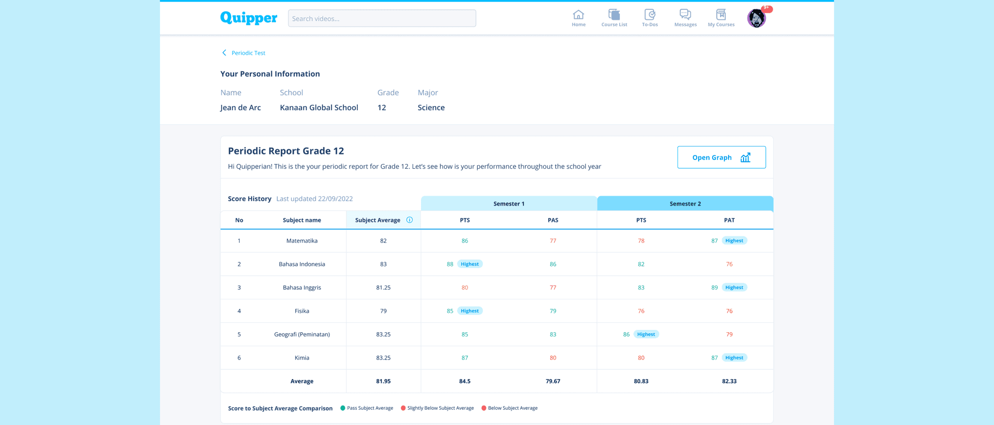
Periodic Report
The first iteration of the periodic report consists of the discussed data, such as student information, subject list, subject scores, test types, and semester information
Click for high resolution image
It is also important to emphasize that I separated between Semester 1 and Semester 2 so that students can read and compare their data more easily.
Highlighting the highest score that the students get is also important to create a goal for them to achieve.
Presenting the average score and information about the comparison is necessary and highly important, as it allows students to reflect on their results.

A visual chart depicting the comparison between the obtained grades and the average grade
Why the average? As I explained during the discovery process, we ensure that the data we present aligns with real-world scenarios, just like the annual report card. In my opinion, this should be sufficient for students to comprehend the presented data
The Second Challenge
❗
Together with the Project Manager, I presented these initial results to the developers. The ideas I came up with were indeed implementable, but due to the extremely limited time available, some of the ideas required more time to be completed in accordance with the design.
Challenge: Technical capabilities are limited due to tight deadlines.
Overcoming the challenges
🌱
Both of these challenges significantly constrain my scope as a designer, as well as for the developers. We engaged in discussions and ultimately agreed that the product development would be divided into several phases. The first phase would involve streamlining the aspects from my first iteration. We also decided to keep the first iteration as the next phase
The second attempt
#2
I collaborated with the Project Manager and Developers, conducting daily check-ins on the progress I made to ensure that the design I created could be executed without any issue. And here are the results.
Notification Access
Unfortunately, we decided to remove notifications from the assessment module in the first phase, as the reason behind it was our inability to mark new reports to be displayed in the assessment module. Not only that, since the dashboard revamp is currently underway, it's challenging to convince the other squads to implement our changes.
Fortunately, new report can still be notified through smartphone notifications.
Report Access
I decided not to separate the Assessment and Report pages, which led us to create a new menu named 'Periodic Report.' To enhance student attention, I added a 'New' badge for easier identification by student.

Periodic Report
Apparently, the existing diagnostic reports weren't labeled by semester, which limited us from categorizing them based on semesters. So what I did was to add the semester name to the table name (such as PTS Semester 1, PTS Semester 2, etc).

The Result
Usability Test
I asked the researcher to conduct a Usability Test with 10 respondents (students ranging from grade 9 to grade 12) in order to better understand how the users (students) interact with this new feature. The result is:
5 out of 10 students successfully completed the task without assistance, and all students in grades 10 and above were able to do so.
All students found this feature very easy to understand, with a note that 6 students initially felt confused about the colors of their grades.
All students felt assisted by this feature because they could compare their grades directly.
All students were initially confused about the location, but they immediately noticed it when they opened the assessment page.
Data Tracking
During the release of the first phase, we decided to track for the first 3 months to determine the completion rate and how many users accessed the Periodic Report.

As suspected, the number of users accessing the periodic report is still relatively low, as we haven't made any product improvements due to feature priorities in this area. We have been relying solely on the Marketing blog and activities.
Hypothesis
🤔
Unfamiliar product naming
The naming of this feature as 'Periodic Report' itself is not very familiar to the students, the language used is too technical, whereas students are more accustomed to simpler terms.
Lack of notification
I also hypothesize that the lack of notice to students about this feature is reflected in the significant difference between the number of eligible users and the number of users who opened the periodic tab. Therefore, in my opinion, notifications in the assessment module are needed.
What’s Next?
We have already planned for the development process of phase 2 from the first iteration and would like to know if the results from the first phase can impact its outcomes. Additionally, we have also planned to conduct usability testing.